Types of Charts in Trading: Line, Candlestick and Bar
A chart is a trader's primary tool. It's how we perceive price movements, look for patterns, and make decisions. In this article, we'll examine the three main types of charts, their strengths and weaknesses, and determine which one suits different trading styles best.
📈 Why Charts Are the Foundation of Technical Analysis
A chart is a condensed history of price. It allows you to assess volatility, trend, and support/resistance levels in seconds. Modern trading is unthinkable without charts: even those who rely on fundamental analysis use charts to choose entry and exit points.
Understanding what information each chart type conveys is basic literacy. And modern services like AemmTrader help interpret this data with neural networks, enhancing your analytical capabilities.
✅ Key Advantages of Using Charts
Regardless of type, all charts provide traders with undeniable benefits. Here are the main ones:
Price History
A chart compresses thousands of trades into a visual image. You see where the price was and can forecast where it might go.
Volatility Assessment
Wide candles or bars indicate high activity and risk. Narrow ones suggest consolidation. This helps set stop‑losses.
Entry and Exit Points
Even fundamentalists use charts to avoid buying at the peak of euphoria or selling in panic.
Risk Management
The chart shows where it's reasonable to place a protective stop‑loss — just beyond the nearest support level or low.
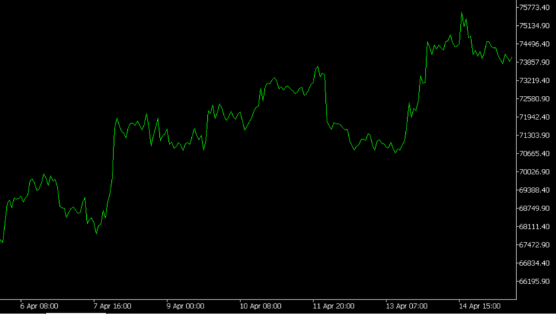
📏 Line Chart: Simplicity and Clarity
A line chart is constructed by connecting the closing prices of each time period (timeframe). It's the simplest type of visualization, filtering out intraday noise and allowing you to focus on the overall trend.
It's often used for quick direction assessment and drawing long‑term trendlines. However, it doesn't show what happened within the period — whether there were sharp spikes or false breakouts.
Pros and Cons
- ➕ Pros: minimalism, easy to read, excellent for identifying global trends and support/resistance levels.
- ➖ Cons: no information about intraday volatility, gaps are invisible as points are simply connected by a straight line.
🕯️ Candlestick Chart: The Language of Professionals
Candlestick charts are the most popular type among traders. Each candle shows four key prices for the chosen period: open, close, high, and low. The candle body is colored depending on whether the close was higher (usually white/green) or lower (black/red) than the open.
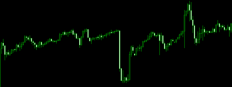
Candlestick analysis helps identify reversal patterns ("hammer," "hanging man," "engulfing") that often precede a trend change. Moreover, all indicators (moving averages, RSI, MACD) work perfectly on candlestick charts.
Father of Candlestick Analysis in the West
"Japanese candlesticks are not just a way to display prices; they are a window into market psychology. They show who is in control: bulls or bears."
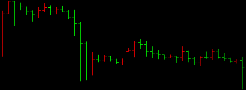
📊 Bar Chart (OHLC): Conciseness and Informativeness
A bar chart (or OHLC chart) displays the same four prices as candlesticks but in a more compact form. Each bar is a vertical line from low to high, with a horizontal tick on the left (open price) and right (close price).
Experienced traders value bars because they don't overload visual perception and clearly show the levels where the price opened and closed. All standard indicators and drawing tools also work on bar charts.
How to Read a Bar
- If the right tick is higher than the left — the price rose during the period (bullish bar).
- If the right tick is lower than the left — the price fell (bearish bar).
🤔 Which Chart Should a Beginner Trader Choose?
Choosing a chart type is a matter of personal preference, but there are general recommendations:
Beginners
It is recommended to start with candlestick charts. They are visual, intuitive, and allow faster mastery of candlestick analysis — a powerful forecasting tool.
Scalpers and Day Traders
Many prefer bars or even tick charts — they provide maximum information about each movement without excessive "artistry."
Investors and Position Traders
A line chart on daily or weekly timeframes is excellent for assessing the global trend and filtering market noise.
Experiment
In any trading platform (MetaTrader, TradingView), you can switch between chart types with one click. Try different options to find your style.
🤖 How Technology Helps Read Charts
Whatever chart type you choose, interpreting patterns and signals requires experience. Modern services like AemmTrader use XGBoost neural networks and Monte Carlo simulations to automatically recognize technical analysis patterns and assess price movement probabilities. This allows traders to find promising setups faster and make informed decisions.
Technology doesn't replace the ability to read a chart, but it greatly enhances it, saving time on routine analysis.